Hannah Lundquist —
As Spring begins to warm things up, students are leaving their coats at home and once again we can see all the different fashions within our student body.
Some students, you’ll notice, like to show off their Stout gear, from T-shirts that proudly display “Stout” to sweatshirts that rep the school with just the ‘S’ logo. Stout logos are all around, and many of their meanings are obvious, but perhaps the least-known about logo is the one that looks like a feather.

For some, a feather logo does not seem to fit the theme of Stout in any way. Stout is based on being a hands-on university, and so the ordinary feather, being delicate and light, does not quite fit in.
“Since Menomonie was a lumber town I thought it maybe had something to do with that, but that doesn’t really fit in with the feather theme,” said Anna Stamschror.
“You use a quill to write so maybe the feather is a quill,” reasoned Jarena Everson, North hall resident and sophomore in the Hospitality Leadership program.
Another theory that’s been around is that the feather looks like waves rolling up to a beach, so perhaps Lake Menomin lent some inspiration.
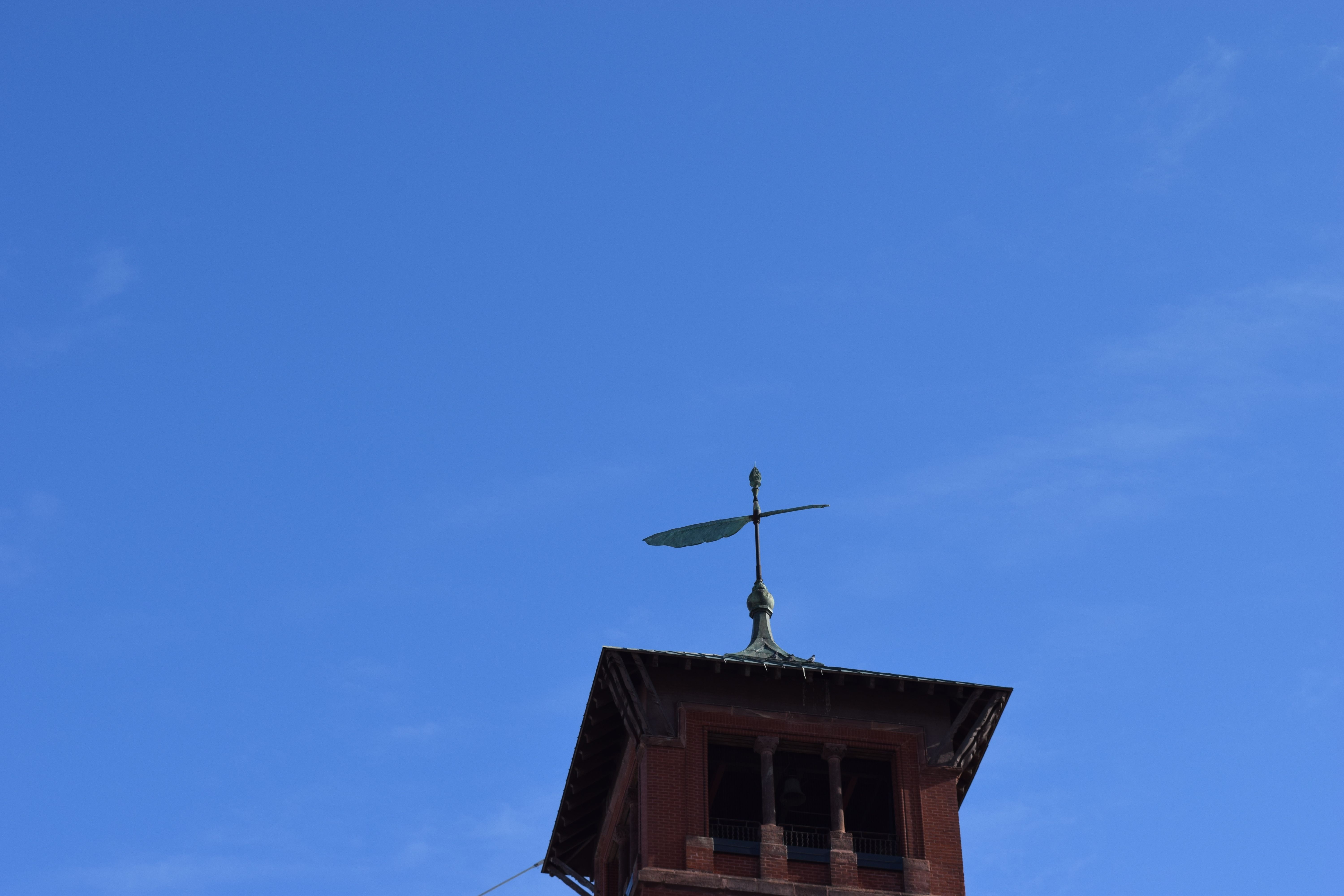
Don Steffan, senior editor at Stout’s University Communications, confirmed Everson’s intuition was correct.
“A design firm in the cities came up with our current logo and the feather is actually a “quill.” The quill was a familiar symbol for education in the 1890s when what later became the university was founded,” said Steffan. The first known instance of the quill appearing as a symbol on campus was when Bowman Hall was built in 1897. Steffan explains, “The quill was chosen as a design for the weathervane at the top of the tower.”
The design firm’s rationale for the quill logo involved Bowman Hall’s iconicity. “Many universities use an iconic building for their symbol, so such a design wouldn’t be very original or set Stout apart visually,” said Steffan. “The abstract rendering of the quill/weathervane was intended to reference a detail from the tower without using the building itself.”
The quill logo was introduced in 1991 in identity standards for Stout, after the University changed their printing needs.
The quill logo made its way onto Stout gear in 1992 from Cy DeCosse. Inc. Unfortunately, they are no longer in business, but there are some books that they published that still bear the name.